Redesigning Medical questionnaire, Checkout & Dashboard for EHVG (E-health Group)
EHVG, an e-health e-commerce platform, embarked on a journey to elevate user satisfaction and streamline the user journey by revamping the anamnesis process, optimizing the checkout experience, and enhancing the user dashboard. This case study presents the comprehensive UX redesign process undertaken to achieve these goals.

Team e-commerce:
Mirjam: Head of marketing / e-Commerce / team lead
Roxanne: Conversion optimization
Karlijn: Customer Experience Expert
Joël: SRO specialist, front-end
Me: Senior UX Designer
Project Goals:
- Enhance user engagement and satisfaction by clarify the anamnesis process.
- Optimize the checkout process to improve conversion rates and reduce cart abandonment.
- Provide users with a clear and intuitive dashboard for managing their health information and orders.
- A total Mobile friendly experience from A to Z in a new optimized future proof responsive design.
- Setup a designsystem
Research and Analysis (team effort):
- Conducted user interviews, and usability testing sessions to understand user pain points and preferences.To achieve this, I have created a clickable prototype of the entire checkout process.
- Improving by identifying industry best practices and benchmarks.
- We analyzed user feedback and data to identify bottlenecks and areas for improvement in the anamnesis, checkout, and dashboard experiences.

Design Process:
- Simplified Flow:
- Restructured the medical questionnaire into manageable sections with logical progression.
- Streamlined the checkout process by reducing unnecessary steps and form fields.
- Easily Activate an account or login saved user profiles for faster transactions.
- User Interface Design:
- Implemented clear visual cues and progress indicators to guide users through the medical questionnaire & checkout process.
- Utilized user-friendly input fields and interactive elements for easy data entry.
- Highlighted important information to clarify the steps, payment options, and order summary.
- Prototype and Testing:
- Developed interactive prototypes to visualize the redesigned anamnesis & checkout flow.
- Conducted usability testing with diverse user to gather feedback and iterate on design improvements.

Comparison table to clearly view the differences between the treatments.
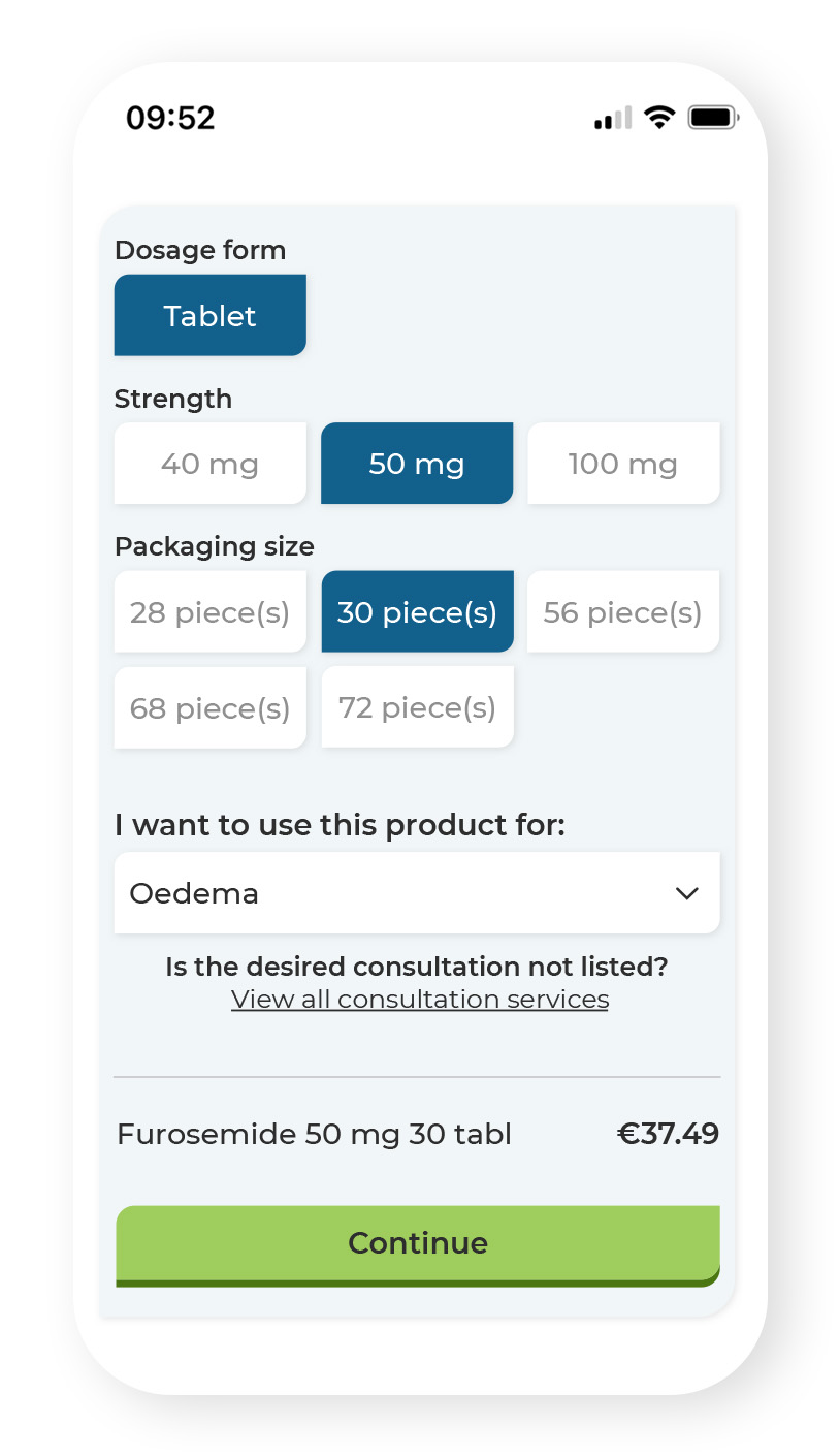
Here you indicate your preference for treatment and the condition.
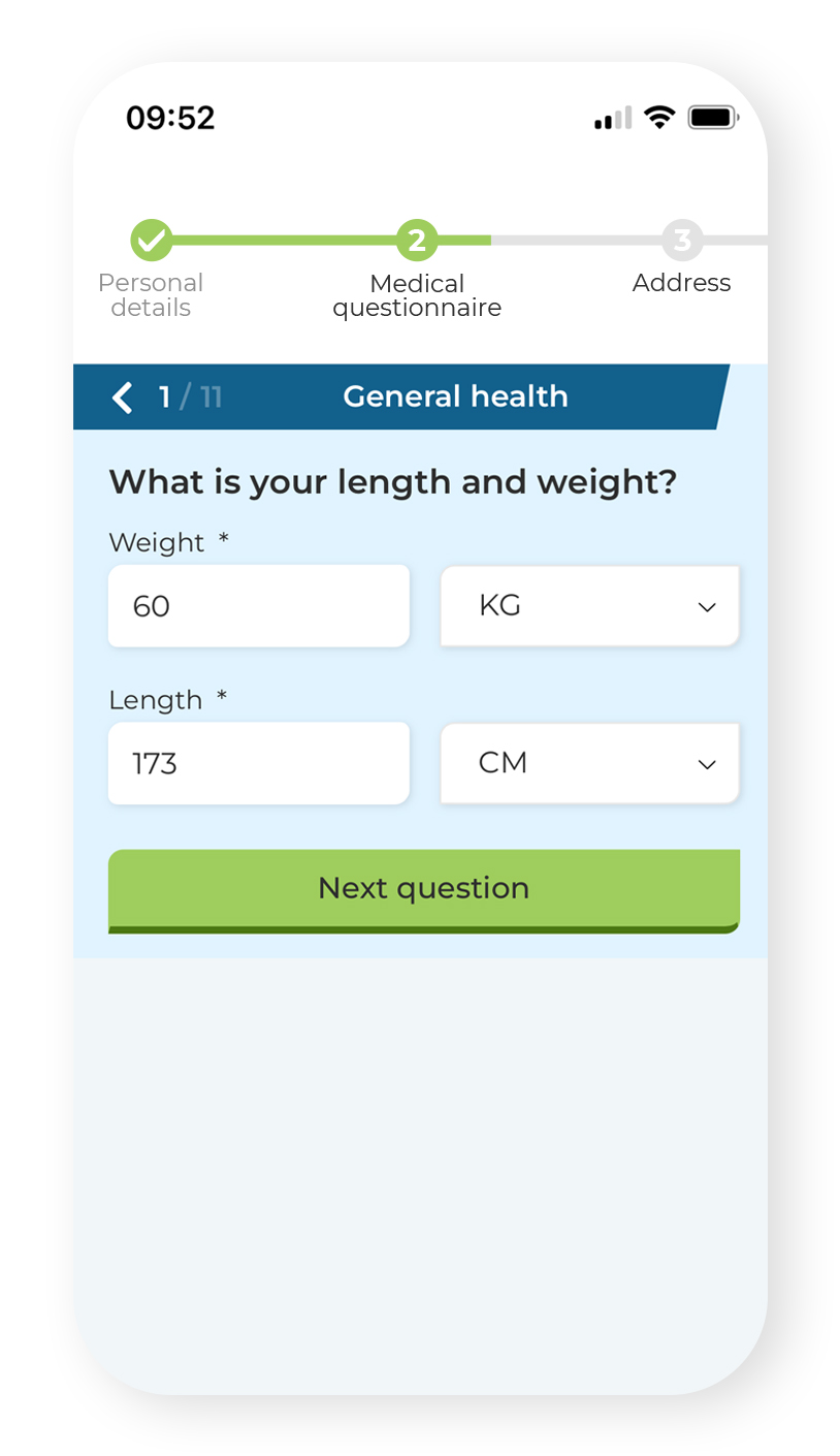
Mobile-friendly medical questionnaire with a clear progress bar.
Dashboard Enhancement:
- Personalized Experience:
- Customized the dashboard to display relevant information and order history for each user.
- IImplemented chat box for contacting the doctor.
- Set personal email preferences.
- Intuitive Navigation:
- Simplified navigation menus and categorized information for easy access and retrieval.
- Easily follow the status of the order process and immediately see whether action needs to be taken.
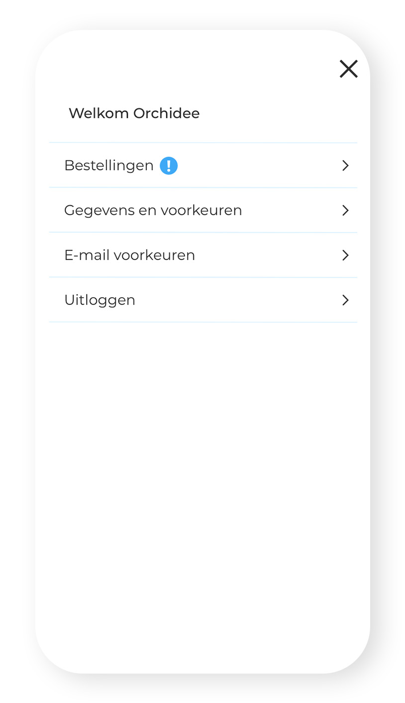
Dashboard overview
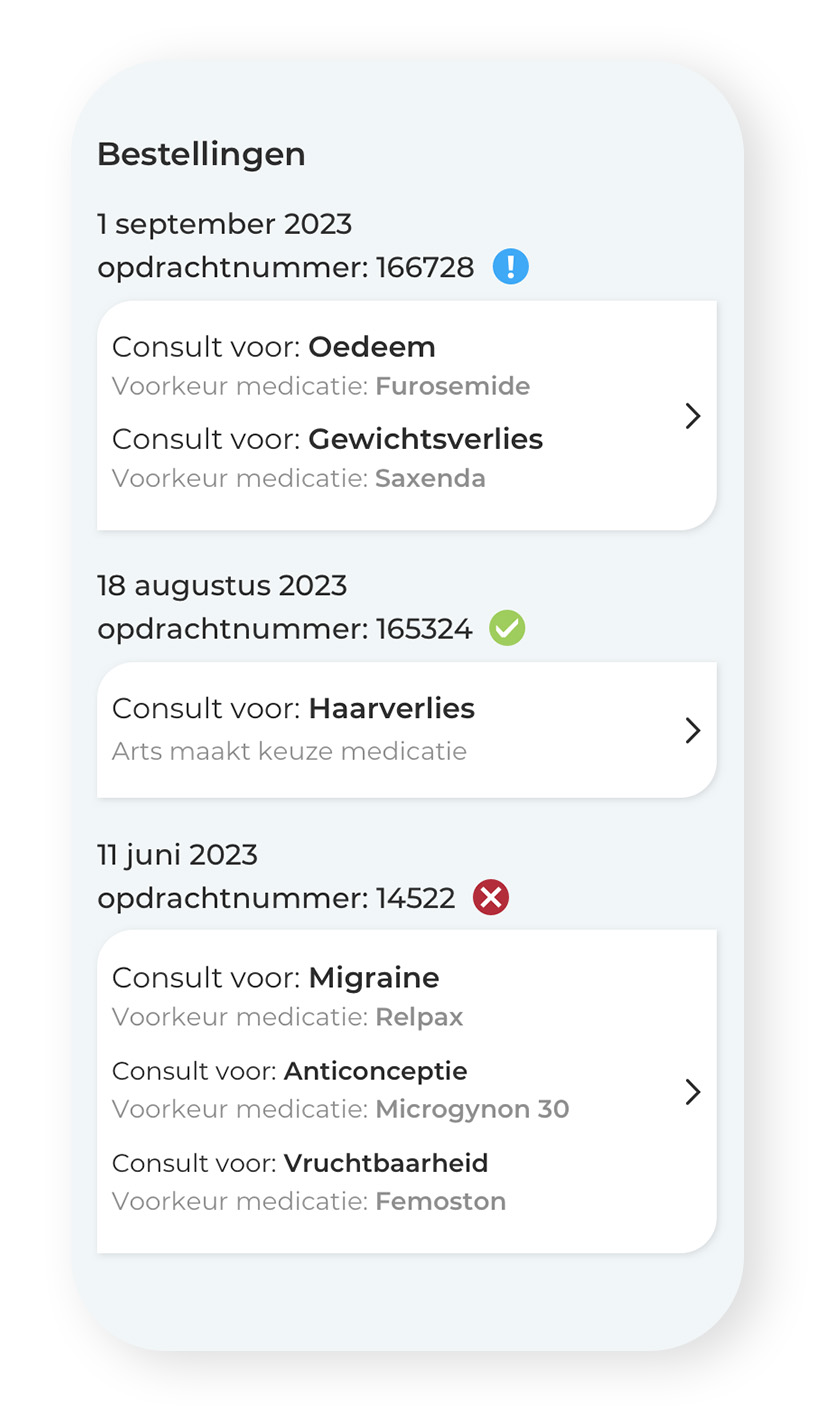
Order information and and order status
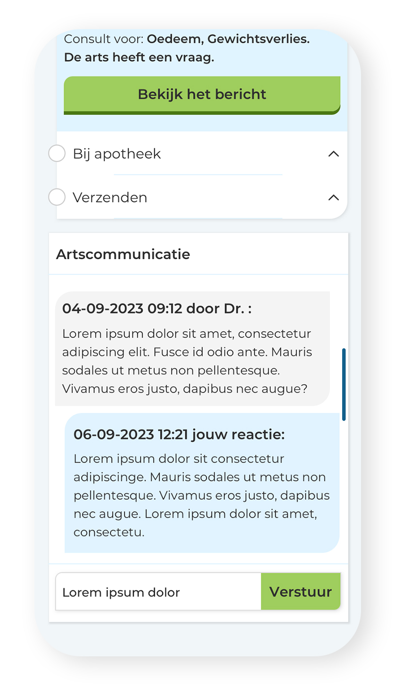
Communication with the dokter
Results and Impact:
User experience and conversion optimizations that have significant increased in conversion rate, CES score, and loyalty. A significant improvement on mobile. A clear checkout process and the onboarding is more user-friendly.
Conclusion:
The redesign of the medical questionnaire process, checkout experience, and user dashboard on EHVG has transformed the platform into a more user-centric and efficient e-health e-commerce destination for self care. By prioritizing user needs and incorporating best UX practices, EHVG has positioned itself as a for users seeking convenient and personalized healthcare solutions.
“You’ve truly elevated UX within EHVG, and I definitely hope to collaborate with you again. Best of luck with all the challenges that come your way.”
Mirjam
EHVG
“Really enjoyed your presence, knowledge, and skills. Your strength as a colleague, rather than just an interim, has helped to accomplish great projects. Best of luck with your next project!”
Roxanne
EHVG
“Thank you for everything Orchidee! It was fantastic working with you. Not only because of your expertise but also because of your pleasant personality! Best of luck with your next projects, and until next time!”
Karlijn
EHVG
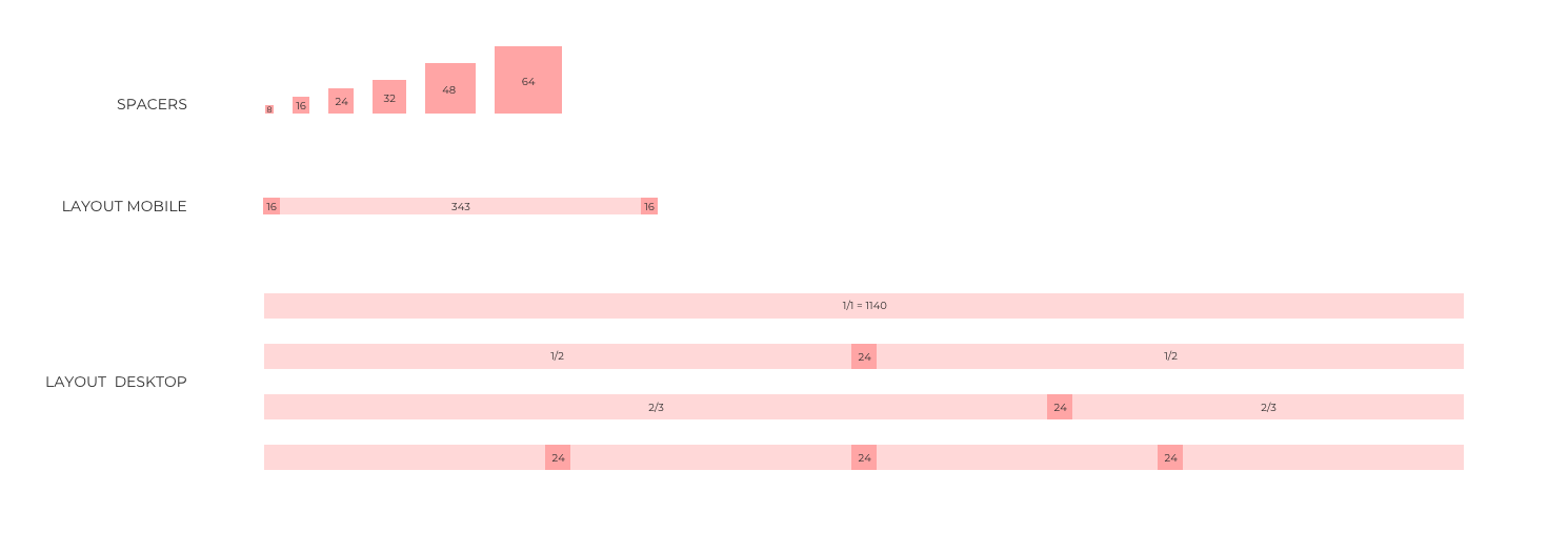
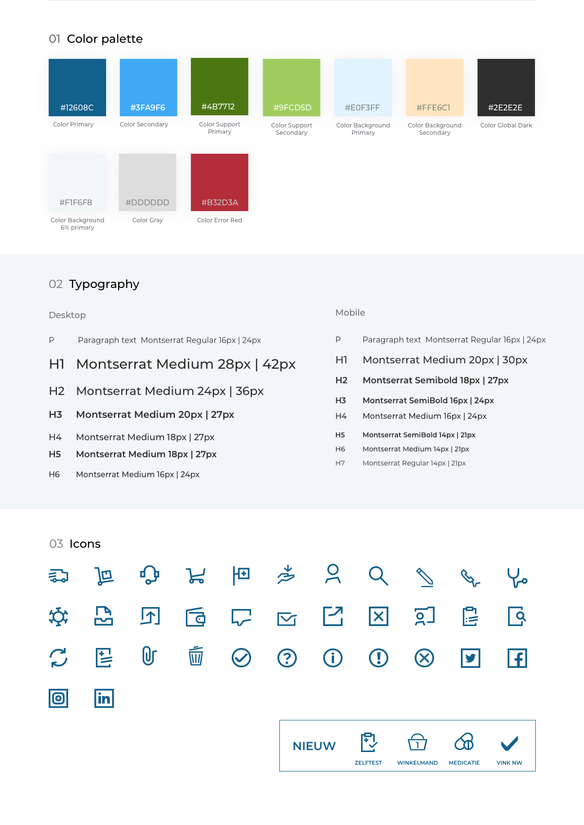
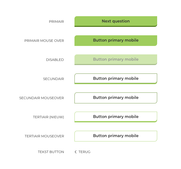
Setting up a Design system

Postcode Loterij game platform
Together with the team of developers, product owner (Data Analyst), and Marketing, we transformed the single-game platform “Deal Or No Deal” (for which I was also responsible) into a multi-game platform. I was responsible for UX – and Visual design.
